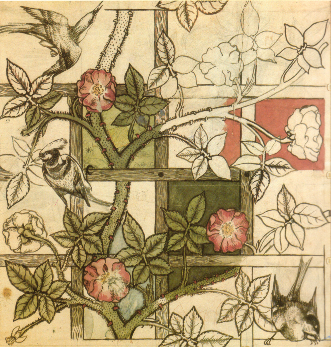
 Trellis Wallpaper · William Morris · 1862
Against the Machine
William Morris · Kelmscott Press · 1891 to 1898
William Morris watched industrial printing produce cheap, ugly books and declared war on it. His Kelmscott Press produced books as total works of art, hand-cut typefaces, ornamental woodblock borders, handmade paper.
By 1910, Arts & Crafts was the dominant aesthetic in book design, decorative printing, and architectural ornament across Britain and America. Every flourish, every border, every leaf declared: a human hand made this.
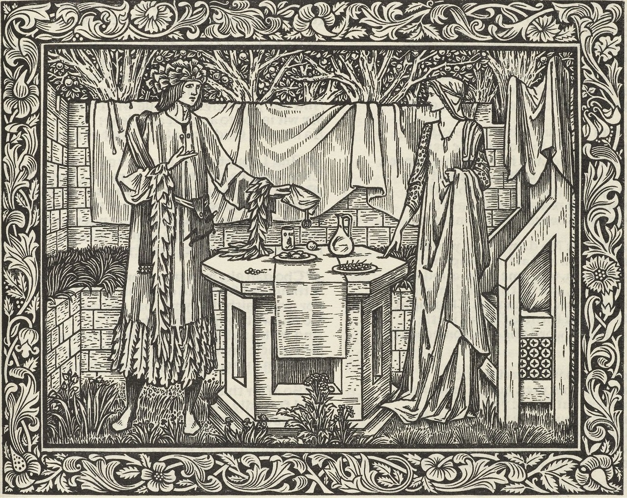 Kelmscott Chaucer · William Morris & Burne-Jones · 1896
The Kelmscott Chaucer
William Morris & Burne-Jones · Kelmscott Press · 1896
The Kelmscott Chaucer is considered the masterwork of the Arts & Crafts press movement. Morris spent two years designing every element: the type, the ornamental borders, the page layout. Burne-Jones contributed 87 woodcut illustrations. Only 425 copies were printed.
The book argued through its very existence that beauty required craft, time, and intention. In an age of machine printing, it was a deliberate act of defiance, and the most influential privately printed book of the 19th century.
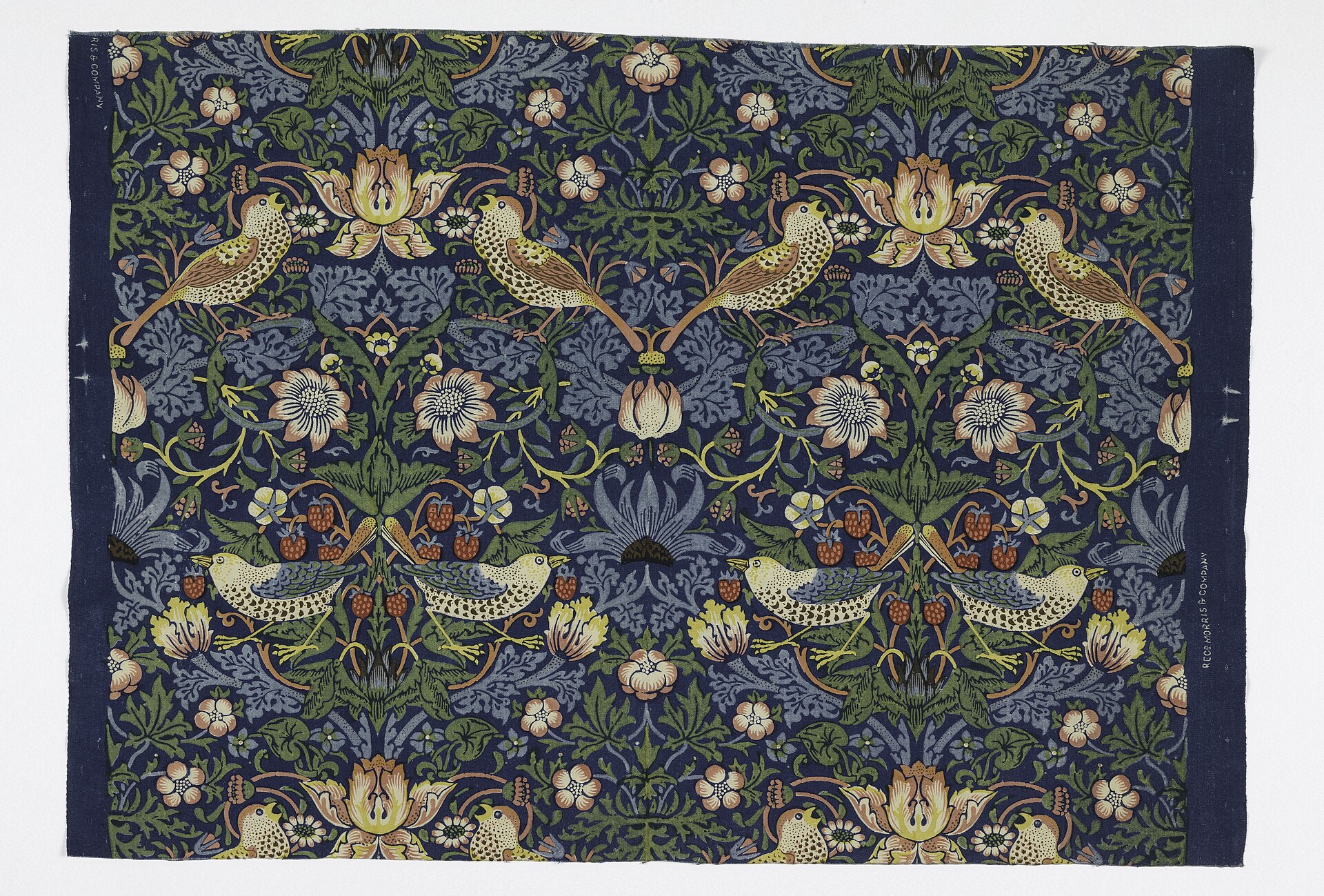 Strawberry Thief · William Morris · 1883
Strawberry Thief
William Morris · 1883 · Indigo-discharge print
One of Morris’s most celebrated textile designs, printed using the traditional indigo-discharge method at his Merton Abbey Works. The pattern shows thrushes stealing strawberries from his garden at Kelmscott Manor.
The intricate repeat required the labor-intensive indigo-discharge process, which Morris specifically revived as part of his commitment to pre-industrial craft methods. It remains one of the most recognized Arts & Crafts designs ever produced.
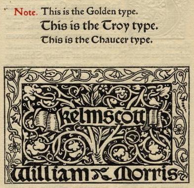 Kelmscott Chaucer · William Morris & Burne-Jones · 1896
The Golden Type
William Morris · Kelmscott Press · 1890
Morris designed The Golden Type for his Kelmscott Press, basing it on 15th-century typefaces by Nicolas Jenson. He believed machine-set type had degraded the quality of the printed book and set out to restore the standards of the earliest printers.
The result was a typeface of deliberate weight and warmth, the opposite of the thin, mechanical fonts industrialization had produced. It influenced every Arts & Crafts printer and planted the seed for the private press movement.
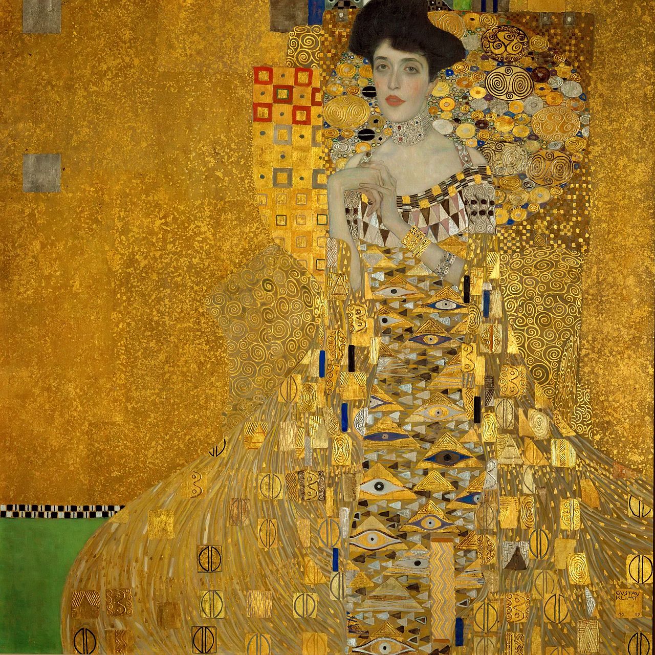 Portrait of Adele Bloch-Bauer I · Gustav Klimt · 1907
Gold, Geometry & Klimt
Gustav Klimt · Vienna Secession · c. 1908 to 1915
The Secession broke from the Vienna Academy to pursue a total art, Gesamtkunstwerk where painting, furniture, typography, and architecture formed one unified whole.
Klimt’s gold-saturated portraits treated the canvas as a flat decorative field. No illusionistic depth, just pattern, mosaic, and geometric ornament. This radical flattening would define European design for the next two decades.
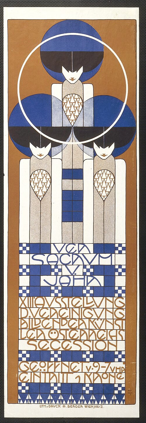 Ver Sacrum Cover · Koloman Moser · 1902
The Werkstätte’s Grammar
Josef Hoffmann & Koloman Moser · c. 1903 to 1920
Josef Hoffmann and Koloman Moser founded the Wiener Werkstätte (Vienna Workshops) to bring Secessionist design into everyday objects. Their visual grammar was a precise system: black and white, geometric grid, gold accent.
The checkerboard pattern, which became their trademark, appeared on postcards, textiles, ceramics, and posters. It was the first truly modern design system: a repeated module generating infinite variation.
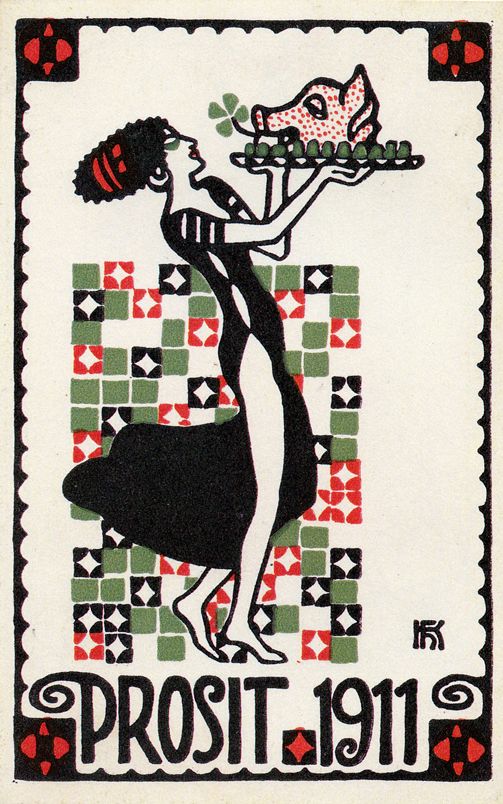 Wiener Werkstätte Postcard · c. 1910
Wiener Werkstätte Postcard
Wiener Werkstätte · Vienna · c. 1905 to 1915
The Wiener Werkstätte produced hundreds of postcards as a primary vehicle for disseminating their design language to a wide audience. Each card was a miniature total design object, geometric grid, flat color, and integrated typography.
The postcard format was ideal for the Werkstätte’s mission: beautiful, functional design for everyday life. These cards circulated across Europe and became some of the most influential printed graphics of the early 20th century.
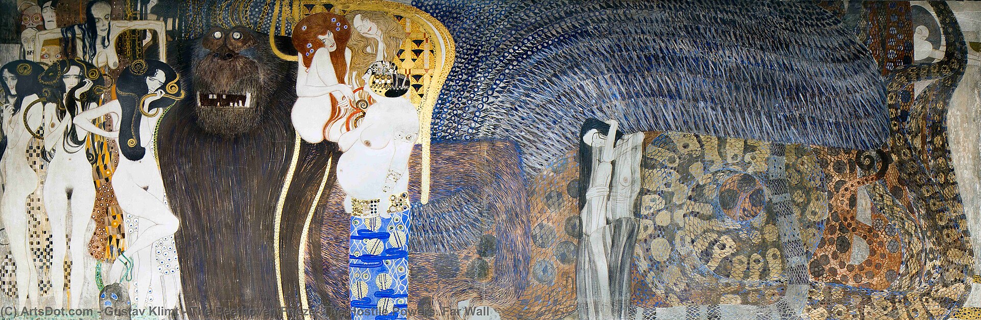 Beethoven Frieze (detail) · Gustav Klimt · 1902
Beethoven Frieze
Gustav Klimt · 14th Secession Exhibition · 1902
Klimt created this monumental frieze directly on the walls of the Secession building as part of a total exhibition environment, the Gesamtkunstwerk in practice. Every element of the space, from the sculpture to the murals to the architecture, was unified into one design experience.
The frieze’s flat, linear figures and gold ornament show Klimt synthesizing Japanese woodblock prints, Byzantine mosaic, and Symbolist painting into a completely new visual language. Its influence on Viennese graphic design, poster art, and decorative arts was immediate and lasting.
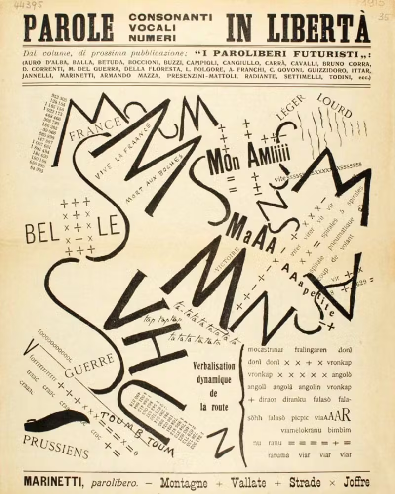 Montagne + Vallate + Strade · Marinetti · 1915
Words in Freedom
Filippo Marinetti · Parole in Libertà · c. 1912 to 1919
Marinetti declared that syntax, grammar, and the orderly grid of the printed page were enemies of the modern world. He invented parole in libertà words in freedom.
Multiple typefaces. Multiple sizes. Words at every angle. The page becomes a sound, a sensation, a battlefield. It was the first movement to treat typography as pure visual energy rather than a carrier of text.
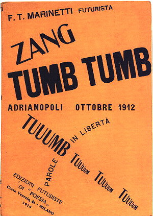 Zang Tumb Tumb · F.T. Marinetti · 1914
Speed, Violence & the Machine
Futurist War Imagery · Italy · c. 1914 to 1918
The Futurists didn’t just observe modernity, they worshipped it. Planes, trains, automobiles, and artillery were beautiful to them. When WWI arrived, many enlisted eagerly and depicted warfare as visual poetry.
Their visual language, explosive diagonals, shrapnel geometry, overlapping movement, entered mainstream poster and newspaper design across Europe. The machine age finally had an aesthetic that matched its energy.
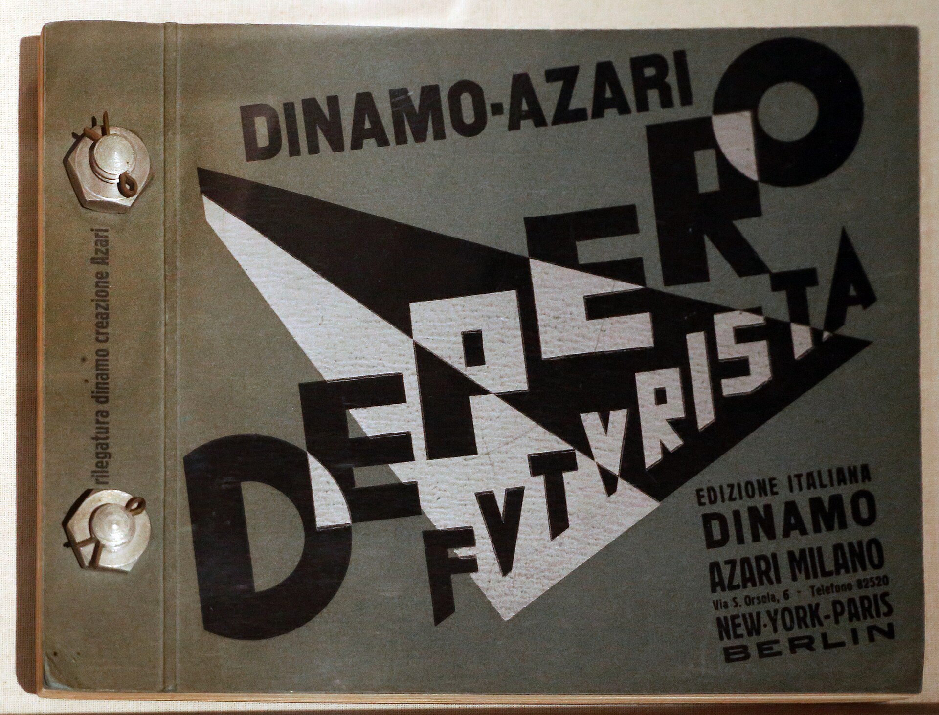 Depero Futurista, The Bolted Book · 1927
Skyscrapers and Tunnels
Fortunato Depero · 1930
Depero was the Futurist who most successfully bridged the movement’s aesthetic into commercial graphic design. He created advertising campaigns, book covers, and magazine layouts that brought Futurist dynamism into everyday visual culture.
This painting shows his signature approach: hard-edged geometric forms, clashing angles, and an almost mechanical intensity. The skyscraper becomes a Futurist symbol, speed, industry, and modernity compressed into architectural form.
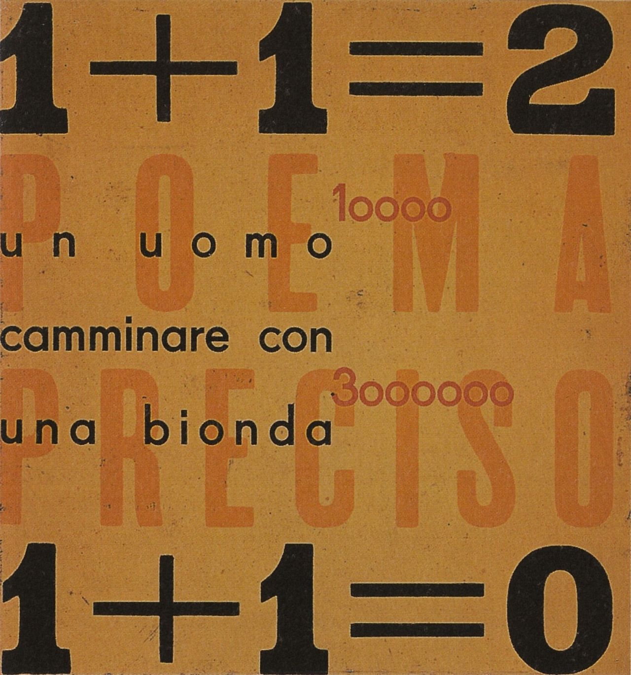 Poema Preciso · Futurist Typography · c. 1920s
Marinetti & the Futurist Manifesto
Filippo Tommaso Marinetti · Founder of Futurism · 1909
F.T. Marinetti published the Futurist Manifesto on the front page of Le Figaro in 1909, announcing a new art that glorified speed, technology, and violence. It was the most aggressive artistic declaration of the 20th century.
His invention of parole in libertà words in freedom, shattered the typographic conventions of the printed page. Multiple typefaces, explosive diagonals, words at every scale and angle: the page became a battlefield where type carried emotional force independent of meaning.
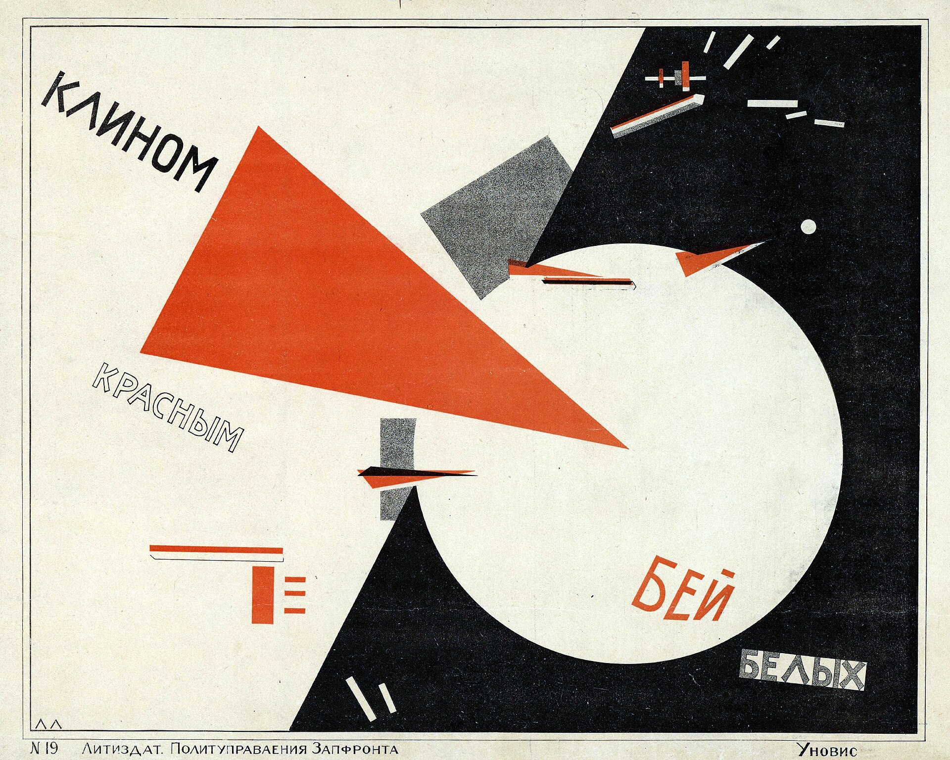 Beat the Whites with the Red Wedge · El Lissitzky · 1919
“Beat the Whites with the Red Wedge”
El Lissitzky · Revolutionary Propaganda · 1919
One of the most important works in graphic design history. After the 1917 Revolution, designers asked: what should art look like in a communist state? El Lissitzky answered with pure geometry.
The red Bolshevik wedge shattering the white counterrevolutionary circle. No illustration, no naturalistic scene, just shape carrying the entire political message. Design had never been this powerful or this reduced before.
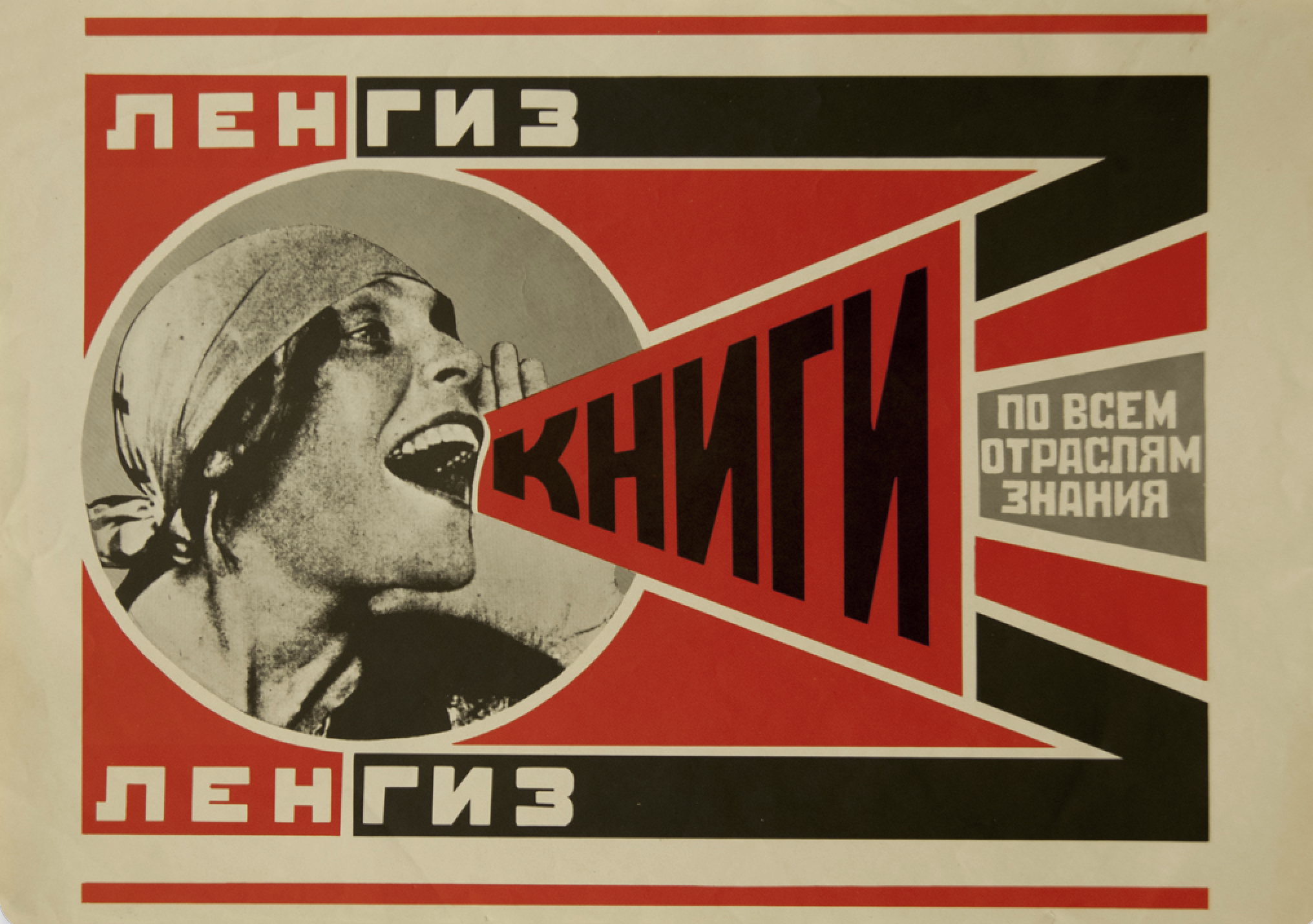 Books (Lengiz) Poster · Alexander Rodchenko · 1925
Rodchenko & the New Typography
Alexander Rodchenko · Moscow · c. 1919 to 1924
Alexander Rodchenko was the Constructivist master of poster design. His rules were simple: red, black, and white only. Sans-serif type. Diagonal composition. Photography over illustration. Geometry over decoration.
These weren’t just aesthetic preferences, they were political. Ornament was bourgeois. Geometry was universal. A poster had to communicate immediately to an illiterate peasant and an intellectual alike.
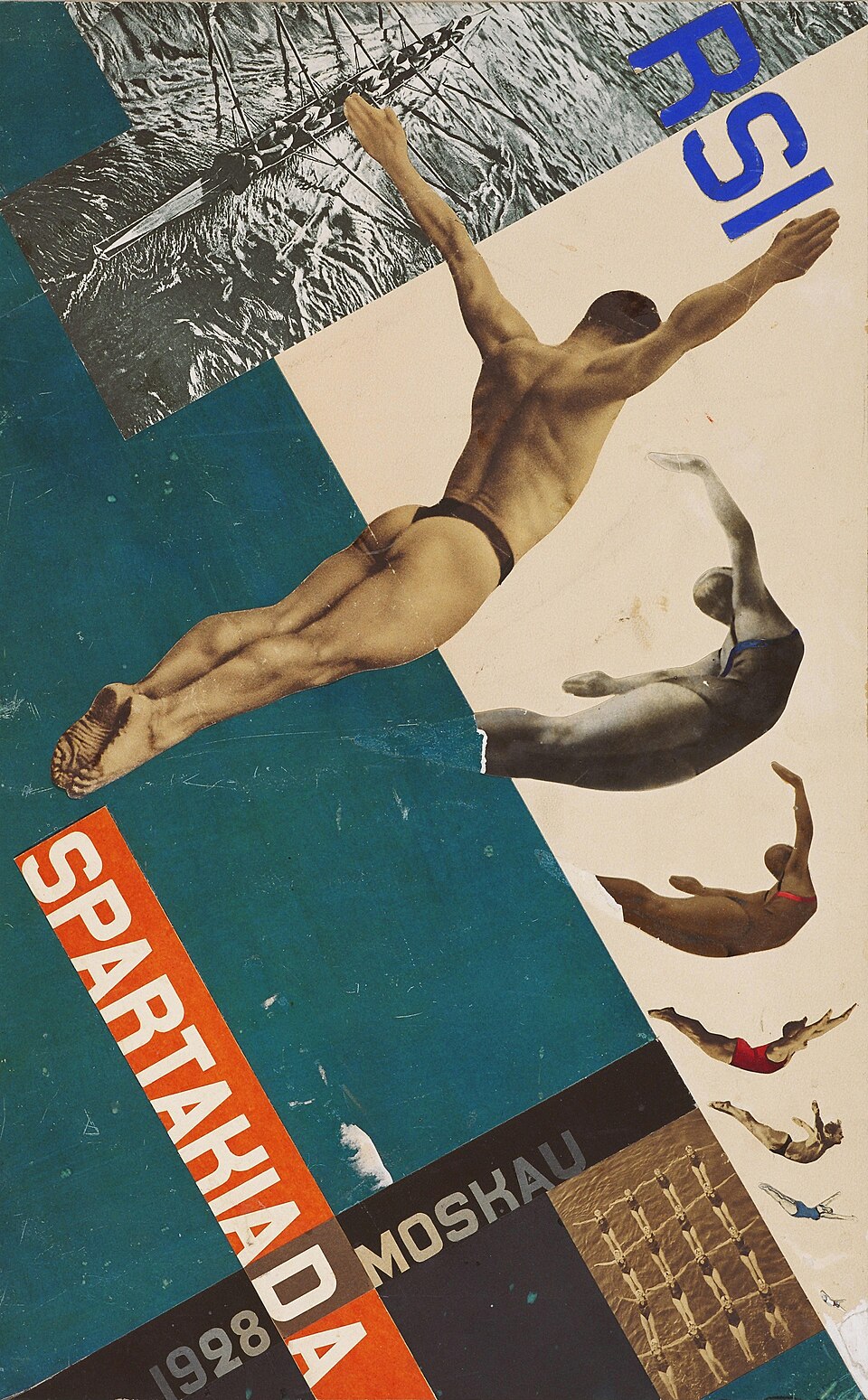 Spartakiada Sports Poster · Gustav Klucis · 1928
Black Suprematic Square
Kazimir Malevich · 1915 · Tretyakov Gallery, Moscow
Malevich called this the “zero degree” of painting, a deliberate erasure of everything representational. Exhibited in 1915 at the “0.10” show hung in the corner of the room where icons traditionally hung, it was a direct challenge to art, religion, and the visible world.
Suprematism, Malevich’s term for this approach, fed directly into Constructivism. If a black square could carry the entire weight of artistic meaning, then geometry could build a new visual language for a new society. Rodchenko and Lissitzky both took this as their starting point.
 Proun 23, No. 6 · El Lissitzky · 1919
Proun: Projects for the New
El Lissitzky · 1919 · Proun series
Lissitzky coined the term “Proun”, shorthand for “Projects for the Affirmation of the New”, for a series of abstract compositions that existed between painting and architecture. They were visual experiments in how geometry could organize space.
The Proun works influenced everything from Bauhaus design to modernist typography. Lissitzky saw them as a “transfer station between painting and architecture”, a way of thinking in three dimensions using two-dimensional tools.